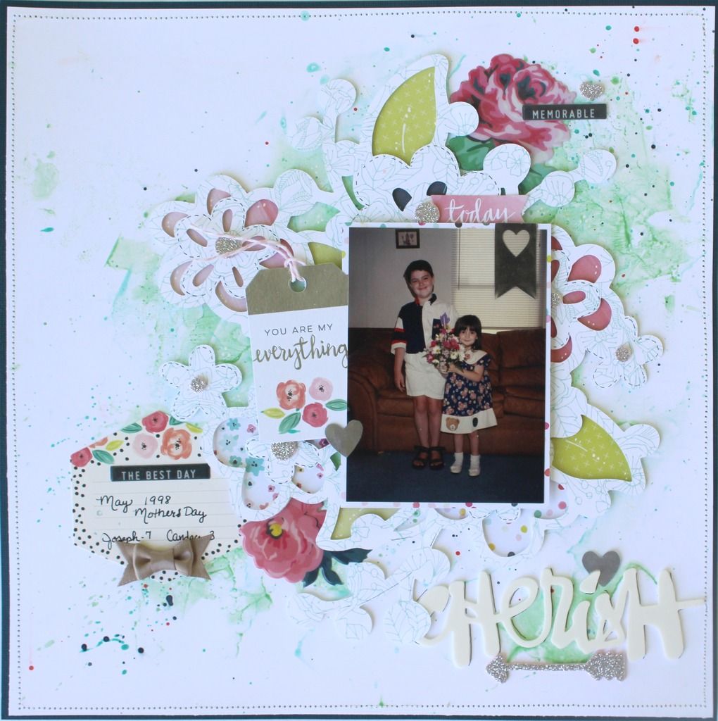
I hope you've been following along and enjoying my new series Focus On Sketches - 3 Ways or More. I'm up with the 3rd and final layout for June's sketch from Creative Scrappers Sketch #295. Don't forget you can play along with the sketch and win a fabulous Jillibean Soup prize.
This week we're looking at changing up the foundational pieces of the layout. If you look at the background you'll see multiple layers of paper cut into squares. I'm sharing how to do a watercolor background and layered digital die cut to take up the same amount of space but give a whole other look to your layout.
I'm also stretching out the tags to take in the space of the journalling. Still two tags but pulled apart to take up more space on the layout. The title remains in the same place.
Here's a look at more of an explanation of how to expand your sketches for more looks.
If you're reading in email click the link below to watch
Focus on Sketches - Cherish
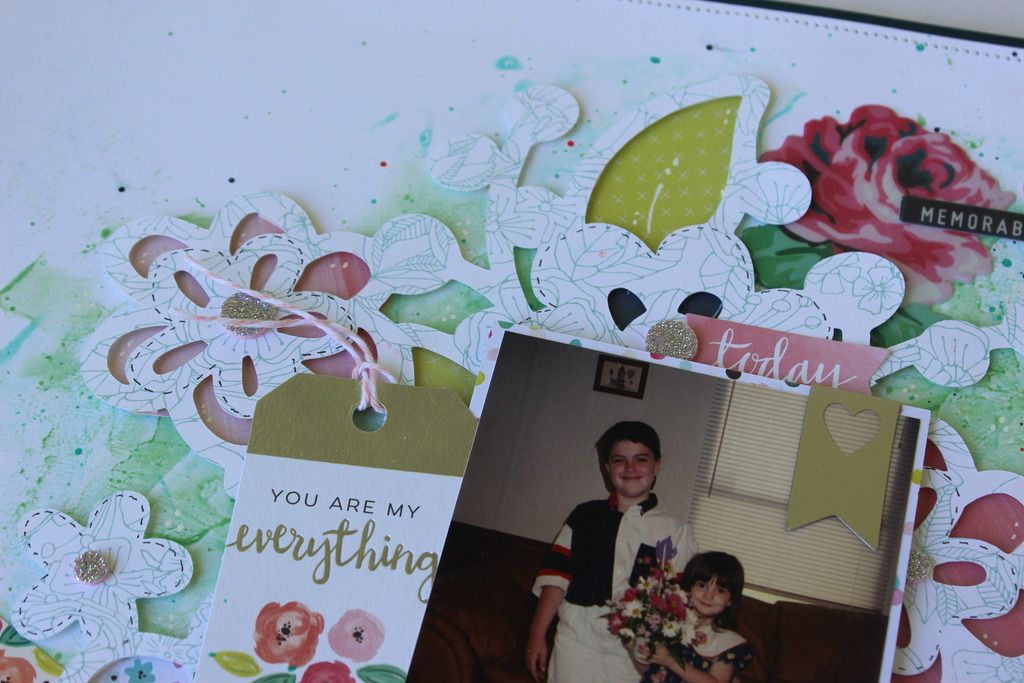
And some close ups
Here's a look at more of an explanation of how to expand your sketches for more looks.
If you're reading in email click the link below to watch
Focus on Sketches - Cherish
And some close ups
Supplies used and links to product
Artistry Cricut Cartridge
Cricut
Cardstock - Navy and White
Pink Paislee Fancy Free 6x6 paper pad
PP Fancy Free ephemera
PP Fancy Free tags
Heidi Swapp Color shine - Navy and Salmon
American Crafts Today white thicker words
American Crafts Cedar Lane Silver thickers
American Crafts Grow puffy stickers
Crate Paper Maggie Holmes bows
Pink Twine
Foam dots
sewing machine
Journaling pen
Hugz
TinaGale


No comments:
Post a Comment